Weary of basic white kitchens that feel more sterile than serene? Join me on a vibrant journey around the globe as we explore the transformative power of color. From terracotta’s earthy warmth to emerald green’s luxurious allure, the right palette can elevate your culinary haven into a wanderlust-worthy oasis.
In this lookbook, I’ll guide you to the bold and beautiful world of contemporary kitchen hues. We’ll discover how to artfully blend jewel tones for maximum drama, cultivate tranquility with soft pastels, and channel the grounding energy of nature’s palette. Whether you crave stimulating shades that ignite conversation or serene tones that quiet the mind, there’s a kaleidoscope of options beyond basic beige. So let’s get inspired and reimagine the heart of your home as a reflection of your free-spirited, well-traveled soul!
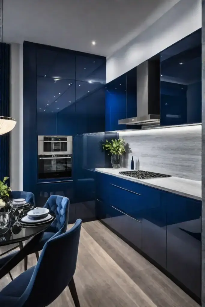
Embracing the Warmth of Monochromatic Magic
Monochromatic kitchens are having a major moment, and it’s easy to see why. These calming, cohesive spaces radiate an effortless sophistication perfect for the heart of the home. But don’t be fooled into thinking one tone means one note. With the right mix of shades, textures, and finishes, you can craft a dynamic monochromatic kitchen that’s anything but boring.
Choosing the Right Shade for Your Space
The key to nailing a monochromatic look? Picking the perfect foundational hue that speaks to your style. For warm, enveloping vibes, try rich terracotta or spicy turmeric tones. If you crave a more serene atmosphere, opt for soothing sage or misty blue-grays. And for those who love the finer things, you can’t go wrong with decadent jewel tones like emerald or plum.
Adding Dimension with Texture and Finish
Once you’ve landed on your signature shade, it’s time to layer in different textures and finishes for depth and interest. Play with matte and glossy surfaces, or incorporate natural elements like rattan, jute, and raw wood accents. The beauty of monochrome is that even the subtlest variations read as intentional.
For example, imagine a kitchen swathed in velvety olive green tones: matte olive cabinets, glossy hunter green backsplash tiles, and a rustic wood island stained in deep mossy hues. By blending multiple shades and textures, you achieve a dynamic, multi-dimensional space that feels both modern and inviting.
Did you know using a monochromatic scheme can make a room appear larger? The seamless flow of color creates an airy, expansive effect. The lack of harsh contrast is easier on the eyes, lending a sense of tranquility perfect for kitchens.
So don’t shy away from monochromatic magic! Whether you prefer bold pops of color or soft, muted tones, committing to a single shade is a surefire way to cultivate a cohesive, contemporary kitchen with serious warmth and personality.
Of course, the monochromatic look isn’t for everyone. For those seeking a more dramatic vibe, allow me to introduce you to the timeless appeal of two-toned sophistication…
The Timeless Appeal of Two-Toned Sophistication
Two-toned kitchens effortlessly marry classic and contemporary design in an irresistibly chic way. By combining two distinct shades, you instantly create eye-catching contrast and visual interest that elevates your culinary haven from bland to bold.
Classic Color Combos That Never Go Out of Style
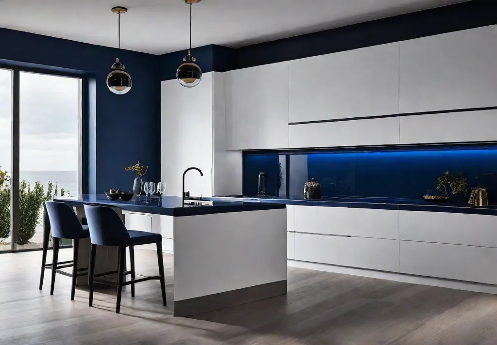
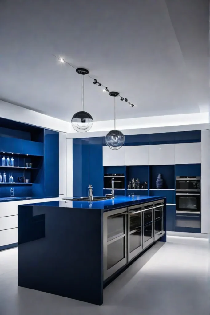
Some two-toned pairings are timeless for a reason. The crisp simplicity of black and white cabinets offers a sophisticated, high-contrast look that works in any style kitchen. For a subtler vibe, navy blue and white is a coastal-inspired combo that feels both tailored and tranquil.
If you crave a little more warmth, try rich wood tones paired with creamy off-whites. This natural pairing brings an organic, earthy flair perfect for farmhouse or rustic kitchens.
Unexpected Pairings for the Color-Obsessed
Why stick to the basics when you can let your color-loving soul run wild? An unexpected two-toned palette instantly elevates your kitchen into a work of art. Some of my current favorite daring duos:
- Olive green and blush pink
- Sunny yellow and deep indigo
- Burnt orange and moody charcoal
Don’t be afraid to go bold! Lively color combos infuse so much energy and personality. Plus, you can easily switch up the accents down the road for an affordable refresh.
Define Zones with Two-Toned Cabinets
Open floor plans are all the rage, but sometimes you need a bit of separation between spaces. Two-toned cabinets provide the perfect subtle divider in open-concept kitchens. Use a lighter tone on the upper cabinets and a darker shade on the lower and island to visually anchor the kitchen zone.
This trick also works wonders for galley kitchens. Paint the cabinets on one side a contrasting color to create the illusion of two distinct areas rather than one long hall.

Tips for Flawless Two-Toned Kitchens
- Consider the flow of colors from connected rooms for a cohesive look
- Balance is key – distribute the two tones so no one color overpowers
- Have fun with colored appliances, lighting, and accessories to tie it all together
- Don’t forget the finish! Pair matte with glossy for extra depth and dimension
The options for two-toned kitchens are truly endless. Just remember, the boldest, most eclectic palettes often stem from an unexpected color pairing you simply can’t resist. So embrace your daring spirit and let those cabinets sing!
Looking for a more serene, minimalist vibe? Neutral hues offer endless opportunities to create cozy contemporary kitchens beyond basic white and beige…
Finding Serenity in Neutral Hues: Beyond White and Beige
Neutral color palettes are often associated with a sense of calm and serenity, but let’s be real – sometimes those all-white or beige kitchens can feel a little too serene, bordering on bland. But fear not, my wanderlusting friends! There’s a whole world of warm and cool neutrals just waiting to infuse your culinary sanctuary with cozy vibes.
Warm Neutrals: Creating a Cozy and Inviting Ambiance
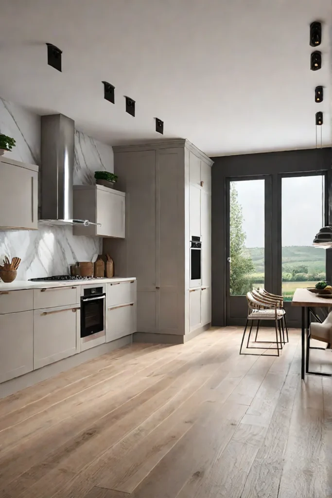
Think rich taupes, toasty beiges, and soft greiges – these earthy hues instantly imbue a kitchen with an enveloping, hygge-esque atmosphere. Warm gray cabinets paired with brass hardware and a veined marble countertop? Chef’s kiss! Throw in some rattan pendant lights and you’ve got a space that’s equal parts chic and welcoming.
Don’t be afraid to play with textures, too. A plush linen banquette, woven baskets for storage, and a vintage kilim runner will add layers of depth and global flair. And let’s not forget the ultimate cozy touch – ample houseplants! A few trailing philodendrons or a stately fiddle-leaf fig will breathe life into your neutral nest.

Cool Neutrals: Achieving a Sleek and Modern Look
For those who prefer a more pared-back aesthetic, cool neutral tones like smoky grays and greiges offer a sophisticated, contemporary vibe. Did you know the color gray is scientifically proven to evoke feelings of tranquility and sophistication? No wonder it’s such a popular choice for modern kitchens!
To keep things from feeling too sterile, incorporate natural elements like wood accents or a live-edge shelving unit. A few strategically placed potted plants will also help soften the space. And don’t be afraid to add a punch of color with a vibrant tile backsplash or a statement light fixture – just look for hues that complement your cool neutral palette.
Practical Tips:
- In kitchens with limited natural light, opt for lighter neutral shades to keep the space feeling bright and airy.
- Incorporate natural materials like wood, stone, and rattan to add warmth and texture.
- Use different shades and finishes (matte, glossy, distressed) to create depth and visual interest.
Key Takeaways:
Neutral kitchens are anything but boring when you embrace warm, enveloping hues or sleek, modern cool tones. By playing with textures, natural elements, and pops of color, you can create a calming yet characterful cooking oasis that perfectly reflects your global spirit of adventure. So go forth and explore the wide world of neutrals, my free-spirited friends!
Feeling daring? Then you’ll want to keep reading for the next section all about using bold colors. Get ready to embrace your most vibrant self!
Making a Statement: Bold Colors for the Adventurous Soul
For those with an adventurous spirit and a love of vibrant hues, bold colors are the way to go in the kitchen. Don’t be afraid to experiment with rich, saturated shades that reflect your personality and unique style.
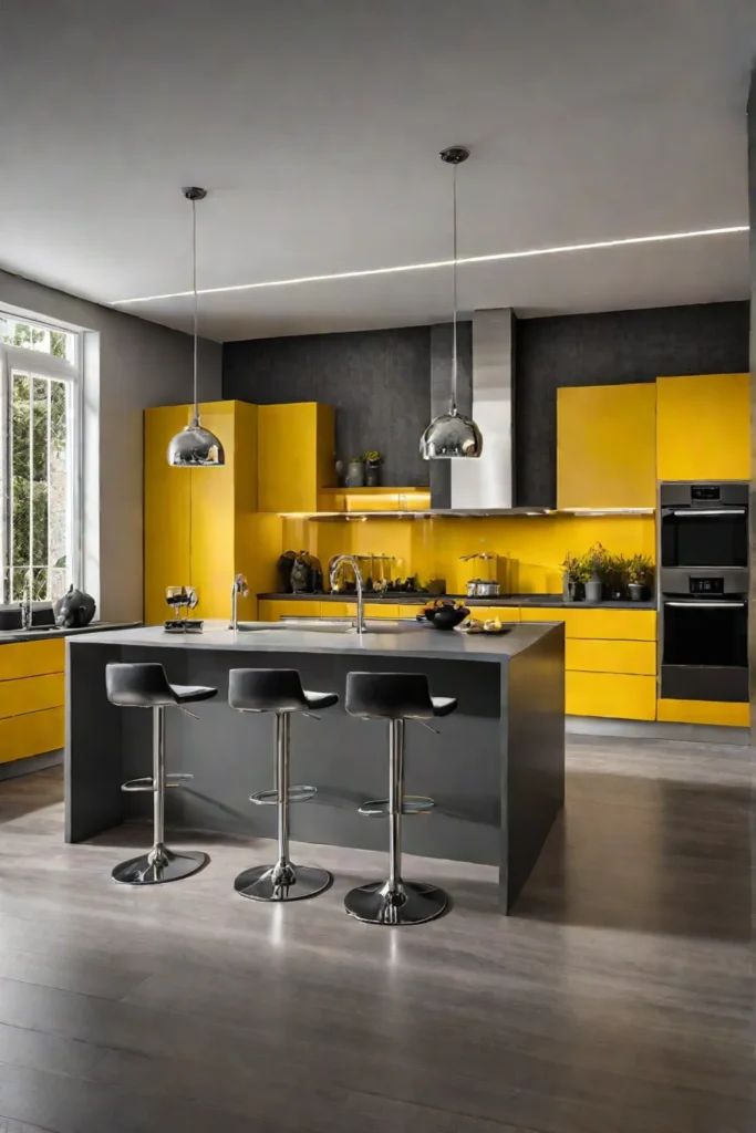
Energizing Hues: Reds, Oranges, and Yellows
Fiery reds, zesty oranges, and sunny yellows instantly infuse any space with warmth and energy. These stimulating tones are perfect for creating a lively, inviting atmosphere in the heart of your home. Incorporate them through painted cabinets, tiled backsplashes, or eye-catching accent walls.

Serene Shades: Greens, Blues, and Purples
For a more calming vibe, consider serene greens, cool blues, and soothing purples. Often associated with nature and tranquility, these hues can transform your kitchen into a peaceful oasis. Use them on cabinetry, islands, or even ceilings for a refreshing burst of color.
Practical Tips:
- Paint your kitchen island a bold blue for a dramatic focal point.
- Use bold colors sparingly on accent walls, backsplashes, or accessories to avoid overwhelming the space.
- In a small kitchen, stick to one or two bold hues and balance them with neutral elements for a cohesive look.
- Play with lighting to highlight bold colors and create a dramatic effect. Strategically placed task lighting or dimmable fixtures can enhance the vibrancy of your chosen shades.
Remember, bold colors are all about embracing your adventurous side and infusing your kitchen with personality. Start with small doses and gradually add more until you achieve your desired look. Life is too short for boring decor, so why not fill your home with vibrant memories from around the world?

Embracing bold hues in the kitchen is a surefire way to create a space that reflects your free-spirited, bohemian style. But if you crave a softer, more understated vibe, fear not – pastels can also be a chic and modern choice.
Pastels Reimagined: Soft Hues for a Modern Touch
Pastel colors are making a major comeback, but these aren’t your grandma’s dusty pinks and baby blues. Contemporary kitchens are embracing sophisticated shades of lavender, mint green, and peach for a fresh take on soft, soothing hues. When styled right, pastels create an inviting, calming atmosphere that still feels modern and on-trend.
Pairing Pastels with Metallic Accents
One of my favorite ways to elevate pastel kitchen cabinets or walls? Mixing in metallic hardware, fixtures, and accents. Imagine a space with sage green lower cabinets and creamy upper cabinets paired with sleek brass pulls and a glamorous aged brass faucet. So chic! For a bolder look, try combining minty lower cabinets with matte black uppers, then warm things up with copper pendant lights and hardware.
Creating a Serene Oasis with Natural Elements
Pastels are the perfect backdrop for layering in natural textures and organic accents. Incorporate woven rattan or cane webbing chairs, a driftwood dining table, and ample house plants overflowing from handmade ceramic pots. Soften the look even more with linen Roman shades and a cozy wool runner. The result is a serene, nurturing kitchen that instantly puts you at ease.

Don’t be afraid to play with different combinations of pastel hues alongside warm wood tones and crisp whites. One palette I’m obsessed with uses a soft lavender on the cabinets, creamy off-white walls, and tons of rattan, jute, and greenery. So dreamy!
Here are some pro tips for nailing the pastel kitchen vibe:
- Use pastel subway tile or a colorful cement tile backsplash to add major interest
- Enhance soft hues with warm, layered lighting like a chic rattan pendant
- Mix in unique vintage or globally-inspired accents to keep things feeling curated, not sterile
- Let in ample natural light to make pastel shades glow
The key with pastels is balancing softness with just the right contrasting elements. Play with textures, incorporate natural materials, and don’t be afraid to mix different shades. Pastels are the perfect palette for creating a modern, serene, and utterly dreamy kitchen oasis.
Feeling inspired by these tranquil yet fresh pastel vibes? Up next, we’re digging into rich, grounding earth tones that connect us back to nature.
Earthy Delights: Connecting with Nature’s Palette
There’s something incredibly grounding about earthy tones – they radiate warmth and coziness, instantly making a space feel like a rustic retreat. By embracing shades like olive green, terracotta, and rich browns, you’re essentially bringing the outdoors in. These hues have an innate connection to nature that can’t be replicated.
Creating a Rustic Retreat with Earthy Tones
The key to nailing an earthy kitchen aesthetic? Layering different organic textures and materials. Olive green cabinets pair beautifully with open wood shelving and a live edge countertop. Terracotta tile floors or a backsplash in a deep sienna add just the right pop of warmth. Don’t be afraid to mix in woven accents like rattan pendants or a chunky jute rug for extra coziness.
To avoid things feeling too flat, incorporate a variety of shades from nature’s palette:
- Olive and sage greens
- Terracotta and burnt oranges
- Deep browns like walnut and espresso
- Creamy off-whites and tans

Adding a Touch of Sophistication with Metallic Accents
While earthy tones are naturally rustic, you can elevate the look with some well-placed metallic accents. Brushed gold hardware, vintage brass pendants, or even copper accents can infuse just the right amount of luxe factor.
Pro tip: use dimmable lighting to make the metallics pop and create a warm, moody vibe in the evenings. Under soft lighting, those rich tones and metallic touches will feel downright luxurious.
There’s just something so inviting about an earthy color palette. Not only do the tones connect us back to nature, but they have an inherent imperfection and variation that adds unparalleled character. Embrace the knots, grains, and tonal shifts in natural materials – those organic details are what give an earthy kitchen its unique charm.
While earthy hues are all about cozying up to nature’s palette, our next kitchen look takes things in a richer, more opulent direction. Get ready to embrace sumptuous jewel tones that radiate luxury and glamour…
Jewel Tones: Injecting Luxury and Glamour
Ah, jewel tones – those rich, saturated hues that instantly evoke opulence and glamour. From regal emerald greens to sultry sapphire blues, these decadent shades have a way of elevating any space into a luxurious retreat. And the kitchen? Well, that’s the perfect canvas to unleash their dramatic allure.
Creating a Dramatic Focal Point with Jewel-Toned Cabinets
If you want to make a statement, consider swapping out those basic cabinets for a set drenched in a jewel-toned hue. Can you imagine how showstopping a ruby-red island would look against creamy white walls and gleaming gold hardware? Or perhaps a deep amethyst would be more your vibe, adding an air of mystery to your culinary sanctuary.
For a subtler approach, you could always do a two-toned situation with jewel-toned lowers and lighter uppers. That emerald green base would be absolute 🔥, especially with some rattan accents and pops of brass to warm things up.
Adding Pops of Jewel Tones with Accessories and Decor
Of course, not everyone is ready to commit to full-on jewel-toned cabinets (although I highly recommend taking that plunge if you can!). An easier way to incorporate these luxe hues? Through accessories and accent pieces!

A set of sapphire blue bar stools would add such a rich punch of color. Or maybe some amethyst pendant lights dangling above your island for a touch of drama. You could even go subtle with jewel-toned dishes, glasses, or small decor pieces scattered around. Just don’t be afraid to play with different shades and let those colors mingle!
One pro tip? Balance out the intensity of jewel tones with plenty of lighter neutrals and metallic accents. A jewel-toned backsplash could look stunning when paired with crisp white cabinets and brushed gold hardware. It’s all about creating that perfect harmony of luxe and light.
And of course, we can’t forget about lighting. Warm Edison bulbs or candles will make those deep gemstone shades look extra lush. But bright, natural light can be gorgeous too – the sun will make those jewel tones just glow.
So don’t be afraid to get a little bold and indulgent with your kitchen color palette! After all, these showstopping jewel tones have been associated with royalty and wealth for centuries. Why not bring that sense of luxury into your own home?
Speaking of color’s power to influence our moods and emotions, the next section dives into the psychology behind different palettes. We’ll explore how to choose uplifting, energizing shades that will make your kitchen a totally happy place. Stay tuned for all the inspo!
The Psychology of Color: Choosing Hues that Inspire
We all know color has the power to transform our moods. Sunsets painted in fiery oranges and pinks make our hearts swell, while the deep turquoise hues of a remote island lagoon instantly lull us into a state of tranquility. So why not wield that same color magic when designing your kitchen sanctuary?
Warm Colors: Stimulating Appetite and Conversation
Spicy reds, sunny yellows, and vibrant oranges are like a triple shot of espresso for the senses. These energizing hues get our hearts racing and our mouths watering, making them the perfect palette for a dining nook or eat-in kitchen. Imagine leisurely brunches filled with laughter and flowing mimosas, all set against a backdrop of terra cotta and turmeric. Now that’s an invitation to linger a little longer!

Cool Colors: Promoting Calm and Relaxation
As much as we love the thrill of a new adventure, our kitchens should also be a sanctuary where we can unwind after long, hectic days. Cool shades of green, blue, and purple have a serene, grounding presence that melts tension and quiets the mind. Painting your cooking zone in these tranquil tones cultivates a sense of Zen, allowing you to find your flow while prepping healthy, nourishing meals.
Handy Hint: Embrace the Power of Blue
Here’s a nifty trick from the color gurus: Studies show that the color blue can suppress appetite. Use varying shades of blue in the kitchen’s main work areas to stay focused on the task at hand rather than mindless snacking.
The psychology of color is a powerful tool for manifesting the right energy in your kitchen. So get creative! Use warm hues in the dining space to stimulate lively conversation over home-cooked feasts. Paint your cooking zone in calming, cool tones to keep your mind centered as you craft culinary magic.
Now that we’ve explored how color can influence your kitchen’s vibe, let’s dive into pulling it all together in perfect bohemian harmony. An eclectic global aesthetic is all about layering colors, patterns, and collected treasures for a space that feels curated and rich with personality.
Creating a Cohesive Look: Tying It All Together
When designing your dream kitchen, it’s important to consider the overall aesthetic of your home. A cohesive look that flows seamlessly from room to room creates a harmonious, inviting atmosphere. Here are some tips for achieving that effortless, well-traveled vibe:
Incorporating Patterns and Textures for Added Interest
Don’t be afraid to mix and match! Layer different patterns like a global nomad – think vibrant tile backsplashes, woven baskets for storage, and patterned rugs underfoot. Combining textures like sleek concrete countertops with raw wood accents adds depth and visual intrigue.
Choosing the Right Lighting to Enhance Your Color Palette
Lighting plays a huge role in how colors are perceived. Use a variety of sources like warm pendants over islands, under-cabinet LED strips for task lighting, and ample natural light to create different moods throughout the day. Position decorative lamps to highlight treasured accessories from your travels.
Here are some additional ideas for a cohesive, wanderlust-worthy kitchen:
- Showcase your global collectibles – vibrant ceramics, carved wood pieces, and woven textiles bring the world home.
- Incorporate natural elements like live-edge wood shelves, rattan pendants, and an abundance of lush greenery.
- Create a cozy, welcoming vibe with plush rugs, comfy textiles, and warm metallics.
Coordinating with Adjoining Living Spaces
In an open floor plan, use consistent materials and complementary hues to visually connect the kitchen to the living areas. Carry the same wood tones, accent colors, and textural elements throughout for a seamless flow.
Mood Lighting for Different Times of Day
Adjustable lighting is key for setting the right vibe. In the mornings, bright task lighting is energizing for meal prep. At night, dim the overheads and let warm lamps cast a cozy glow for winding down with a glass of wine.
The key is balancing cohesion with your unique, well-traveled spirit. Don’t be afraid to break “rules” and experiment until you achieve that effortless global aesthetic you crave. After all, the best kitchens are collected over time through exploration and discovery!
Creating a kitchen that reflects your wanderlust is all about the details. With thoughtful material choices, lighting, and curation of your treasured finds, you can craft a truly one-of-a-kind space that energizes and inspires. Now, on to the next room…
Beyond the Kitchen: Color Inspiration for the Entire Home
Your kitchen’s color palette can be a source of endless inspiration for decorating the rest of your home. By carrying those hues into adjacent spaces, you’ll create a cohesive, harmonious flow that feels intentional and well-designed.
Creating Flow and Harmony Between Rooms
The key to a visually seamless transition is using your kitchen colors as accents throughout the rest of your home. For example, if you have a moody blue and terracotta kitchen, incorporate those shades through textiles like throw pillows and rugs in your living room. Or hang artwork with pops of those colors on the walls. This creates a subtle thread that ties the spaces together.

Adapting Your Color Palette for Different Spaces
While you’ll want to maintain a sense of continuity, it’s also important to adjust the intensity and saturation of your colors to suit each room’s unique mood and function. In low-traffic areas like bedrooms, opt for softer, more muted tones that cultivate a serene ambiance. For lively gathering spaces, punch things up with richer, more vibrant shades.
Here are some tips for transitioning your palette:
- Living Room: Incorporate your main kitchen colors through large upholstered pieces like sofas or armchairs. Layer in varying shades through accent pillows, throws, and artwork.
- Dining Room: Bring in those hues through textiles like table linens, chair cushions, and window treatments. A colorful area rug can also help bridge the kitchen and dining spaces.
- Bedrooms: Use the most muted, toned-down versions of your palette. Opt for soft bedding, curtains, and rugs in those gentle hues.
- Home Office: Liven up a workspace with splashes of your kitchen’s most vibrant accent colors through desk accessories, artwork, and planters.
By letting your kitchen color story unfold organically throughout your home, you’ll cultivate an immersive, globally-inspired aesthetic that celebrates wanderlust and discovery.
As you transition into new living spaces, remember that color has the power to transport and transform. So embrace an adventurous spirit when it comes to decorating your entire home!
Final Thoughts
As our colorful journey comes to a close, I hope you feel empowered to embrace an adventurous spirit when it comes to kitchen design. Don’t be afraid to go bold with saturated jewel tones or experiment with unexpected palettes that speak to your wanderlust. This is your canvas to curate an immersive, globally-inspired aesthetic rich with personality and cherished memories.

Remember, the perfect color story often reveals itself through exploration and an open mind. So keep discovering, keep collecting inspiration from the farthest reaches of the world, and keep infusing those hues into your haven. Because at the end of the day, the most striking kitchens aren’t just spaces to prepare meals – they’re a vibrant celebration of your unique journey.
Now go forth and let your culinary sanctuary’s walls, cabinets, and accents sing a kaleidoscopic anthem of all the places you’ve been and the adventures yet to come. After all, life is too short for boring decor, am I right? The world awaits one deliciously colorful kitchen at a time.